
 button.
The form of the plots is generally determined by the stratigraphic relationships and the type of calculations performed. The plots are divided into up to four pages or groups of pages:
Calibration data: whether or not to view the plots on the calibration curve and whether radiocarbon ages are given as percent modern or BP.
Show: you can decide whether to display the ranges (if they have been calculated); if the distributions are to be shown these can be solid black or in outline and there is an option to normalise all distributions to the same area; the prior distributions can be shown in outline on posterior plots.
X-Axis: the default is BC/AD - Calibrated BP or Radiocarbon BP can also be selected; the label can be omitted.
Multiple Plots: plots can be forced to be individual (this also displays convergence data if it has been included at the time of calculation); the analysis structure and agreement indices can be shown or not as required; the number of plots per chart can also be altered.
Once a plot has been created these aspects can be changed by reloading the
plot using the  button or [File|Options] on the
plot viewer.
button or [File|Options] on the
plot viewer.
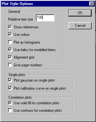
General: the relative size of the text can be altered; references and page numbers are optional as is the use of colour and italic labels for posterior distributions; the alignment grid is also optional.
Plotting can either be as smooth polygons (default) or as rectangular histograms.
Single Plots: whether or not to show the gaussian distribution and the calibration curve.
Correlation plots: solid fil and contour plots can be chosen.
The advantage of this method is that if the model is changed slightly and recalculated the plots will still be properly formatted.

The organisation you create can be saved with a different file name to ensure that it is not over-written by a repeat calculation. This gives considerable flexibility in arranging plots.
By raising the bar at the bottom of the window the text version of this plot organisation file can be viewed and changed. The format is given in the section on File Formats.
To access the raw data of the individual calibrations, right mouse click on the relevant icon in the plot organiser - this will bring up an editor window. This will not work if convergence data has been included as this makes the files too large to edit. See section on file formats.
button or [File|Options] but this will undo any changes made through the [View]
menu.
 button.
You can scroll around the calibration curve by clicking on the
button.
You can scroll around the calibration curve by clicking on the
 button: this will
create a scroll control which allows you to look through the curve.
button: this will
create a scroll control which allows you to look through the curve.
It is also possible to plot results on the calibration curve while
viewing a plot after calculation in a subsidiary window. This is
most easily achieved by using the  button.